
I joined ServiceNow in 2015, and I’ve been working with Service Portal ever since. Before joining ServiceNow, I was building full-stack applications that used the AngularJS framework, which Service Portal also uses. I’ve built so many portals and widgets over the years that I’ve lost count. Regular readers will be familiar with my experiences with Service Portal, with the majority of articles on this blog and a few in-depth articles being about it.
ServiceNow’s gradually moving towards a new tech-stack, called Next Experience. I’ve been working with Next Experience since the ability to create custom components first became possible about 3 years ago. Initially, this was just to add components to the related items area, the ribbon, and the sidebar of the first Agent Workspace. However, with UI Builder, Workspaces, Playbook Activity UI’s, and Virtual Agent Custom Controls being introduced, Next Experience Components are now one of the most powerful pieces of “pro code” that you can write as a ServiceNow developer. In total, over the last few years I’ve built about 40 custom components, and I feel I have a pretty good understanding of the benefits over Service Portal widget development.
Service Portal still has life in it, however as ServiceNow developers we will be using this new framework an increasing amount in the coming years. In this article, I’m going to explain some of the key learnings and points to understand about Next Experience Components (“components”) when contrasted with the Service Portal Widgets (“widgets”), to hopefully give you a jump start as you make your way into this new paradigm.
Developer Experience
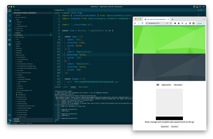
The most obvious difference between developing widgets and components is the development environment. Components are developed entirely locally, in your IDE of choice (e.g. Visual Studio Code), and are supported by the ui-component extension of the ServiceNow CLI utility available on the ServiceNow Store. When you’ve created a component project locally and it’s ready to be deployed to an instance, the deploy command is executed which runs a build process over these local files and converts them to records that get loaded onto the instance that ServiceNow CLI is pointed at.
This local development and build experience is one that will be very familiar to people with a web development background. The ui-component extension sets up a local web server on your machine, which serves up example versions of your components. The webpage hot-reloads immediately when a change is made to the component code on your machine. The development experience couldn’t be better in my opinion; this “Edit, save, auto-refresh, repeat” developer experience is super productive and has become a standard practice in web development for good reason.
Contrast this with the widget development experience, depending on your internet connection quality, and the physical distance from the data center your development instance is located in, you might end with upwards of 200ms delay from when you save changes to your widget, to when you see those updates reflected in the “preview” pane of Widget Editor. This can get quite painful and frustrating when at the height of development you might be making upwards of 10 changes per minute to a widget.
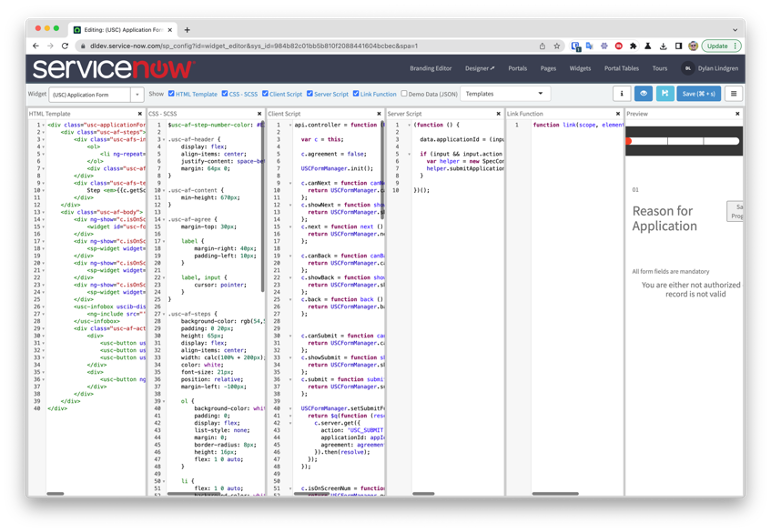
Alternatively, instead of using Widget Editor you can use the official ServiceNow extension for Visual Studio Code to synchronise all the widget fields for local editing. This does improve the widget development experience, however the extension doesn’t support Tokyo’s ES2021 at the time of writing, and even if it did once that ES2021 code makes its way back onto the instance it may cause issues in Widget Editor as ES2021 is not supported there either.
With components, you’re totally free to use ES2021, as everything in the tooling is fully compatible with it.
Developer Effort
In my experience I find custom interfaces in Service Portal require a lot more widgets to be built than for a comparable interface in Next Experience built with components.
For example, a Next Experience application I built recently needed 6 components, and a Service Portal application I built recently needed 15 widgets. Although they weren’t absolutely comparable applications, they were close enough to make this comparison resonate with me.
Part of this is because of the huge feature set and flexibility that UI Builder introduces, which means you can build components that are much more flexible and reusable by deferring a lot of use case-specific functionality to UI Builder.
In Service Portal, you may end up needing to create multiple very similar widgets, just because Service Portal Designer is really only capable of building high-level page layout, and so it’s not possible to defer things like data retrieval, or lower-level layout to it for example.
Service Portal Widgets
To make a Service Portal widget reusable, a developer really has only two things to play with: widget options, or SASS variables.
Widgets options allow you to configure each instance of a widget to have altered behaviour. What things are configurable are up to the developer of the widget. The server script, client-side JavaScript, and template all have access to the value supplied to these options for that instance of the widget. The developer can write code to change the behaviour of the widget depending on the values supplied through those options.
SASS variables allow you to override the styling of the widget by re-declaring that SASS variable at the Theme, Portal, Page, or Widget Instance level. Which of these places you define the override will determine how globally that override applies, and if it’s declared in multiple places, which declaration has priority (read more about this in my article about Service Portal CSS). If for example you define the override at the portal level, every instance of the widget that appears on that portal will have that override applied to it.
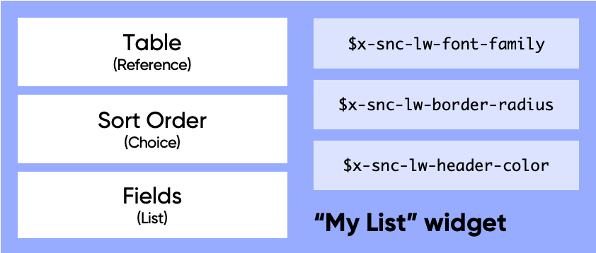
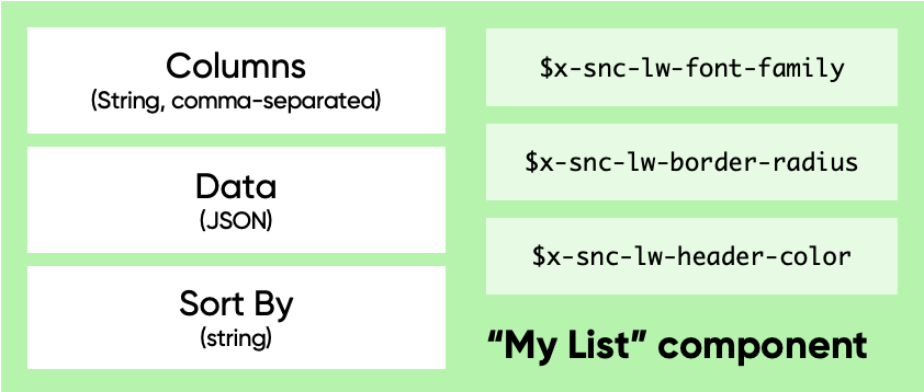
The below diagram shows an example widget called “My List”, with a Table option on it. This option allows you to select a table when you use that widget in Page Designer, and the widget might have code which retrieves records from that table and shows them inside a list. It may also define a SASS variable called $lw-border-radius, allowing developers using that widget to alter of the radius of the border that surrounds the list.
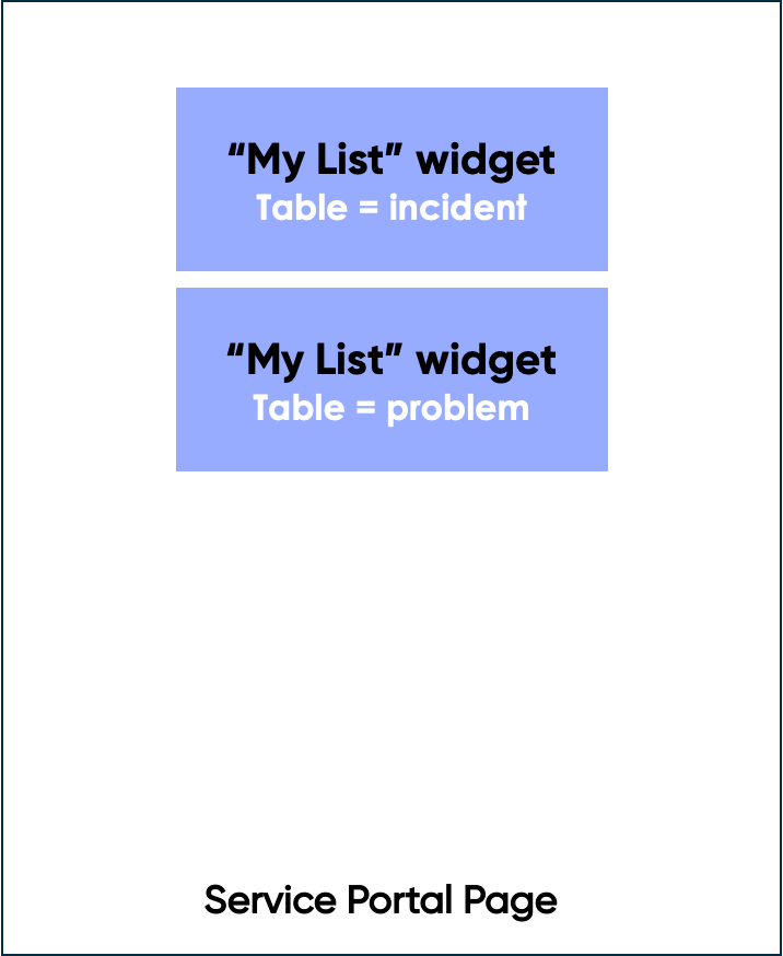
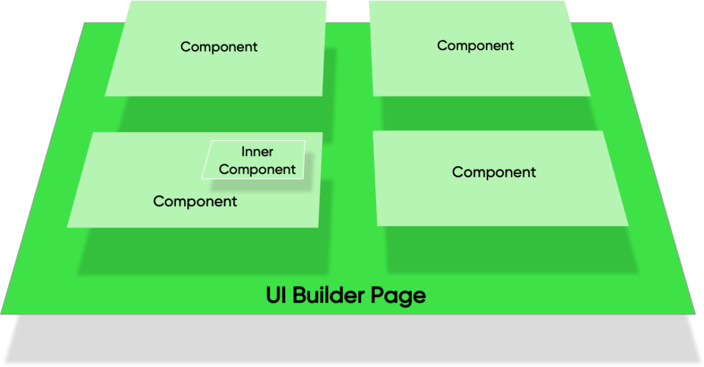
When it comes to using the My List widget, you can add multiple instances of it on a Service Portal Page using Page Designer. Each instance can have different values supplied to the options. The diagram below shows a Service Portal page with two instances of the My List widget on it – one will show incident records in the list, and the other will show problem records.
The primary reason why truly reusable widgets are so hard to create in Service Portal is down to the fact that Page Designer’s primary purpose is providing static values for these widget options – rather than dynamic ones, at runtime. There are ways to make them dynamic, such as using a “Script” field on the widget instance table but doing so introduces a huge amount of complexity and so I barely ever see this done.
You can also leverage an Angular JS Service, or get tricky with $rootScope to offer your widgets more reusability. Both of these options however are very complex, and there’s no way of adjusting this behaviour in Page Designer which is the primary place where you want the reusability of widgets to be leveraged.
Another reason is that as previously mentioned, Page Designer only has the ability to control the layout of a page at a high-level. When you want do this at a lower level, you usually need to resort to giant, monolithic widgets that ignore Page Designer and just do the layout through code. You can use embedded child widgets to modularise these widgets and make them easier to work with, but it is still all done through code. Again, this discards Page Designer from the answer, which is where we would want to leverage the reusability, especially for no-code/low-code developers.
Next Experience Components
The component counterpart to widget options are what is called “properties”. The types of properties you can use are similar to those possible with widget options, however the one key difference is that the values of these properties can be generated dynamically, at runtime, with their values supplied based on how the page is configured in UI Builder.
Let’s look at what the “My List” widget would look like if it were in component form:
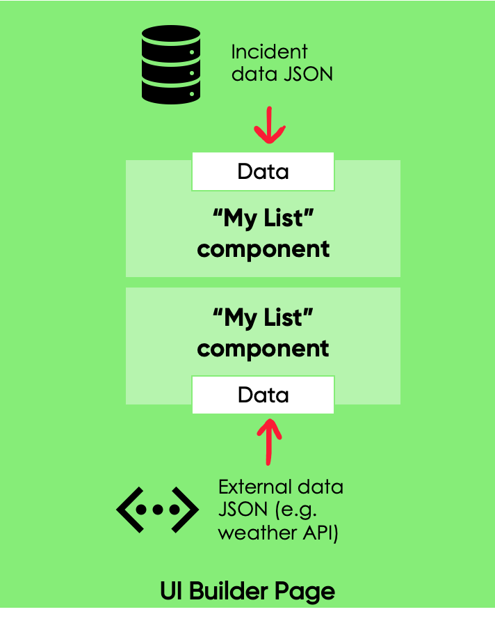
The biggest difference is that the Table option is now gone, and it’s been replaced by a property called Data. It is possible to define a widget option of type JSON, and so technically we could create an option like this on a widget. However, as the values supplied to these options are not dynamic in Service Portal it would be pretty useless.
In UI Builder however the values supplied to a component through its properties are very much dynamic. With this My List component placed onto a page in UI Builder, we could use a Data Resource to supply data about Incident records to an instance of that component. And for the second use of the component, we could supply a list of locations and weather provided by an external weather API.
It should be instantly recognisable from this example how much more flexible you can make components compared to Service Portal widgets. By letting UI Builder handle the data retrieval task, a component is responsible for just presentation and interaction, and how that connects to the back end is up to what you do in UI Builder. By moving a lot of the responsibility to the UI Builder page, it is in effect a form of Inversion of Control.
This is not to say you can’t build a component that handles the looking up of data, or that updates data on the server; you don’t have to use a Data Resource in UI Builder. You can still create what’s called a “Connected Component” if you want to – one that is “connected” to data. A connected component might use a HTTP request to talk to the Table API and get a list of incidents for example. However, whether to create a connected component, or one that purely does presentation & interaction is an option left to the developer of the component, rather than forced upon them by the limitations of Service Portal Designer.
Data Flow
One other aspect to Next Experience components is that the flow of data and events is uni-directional.
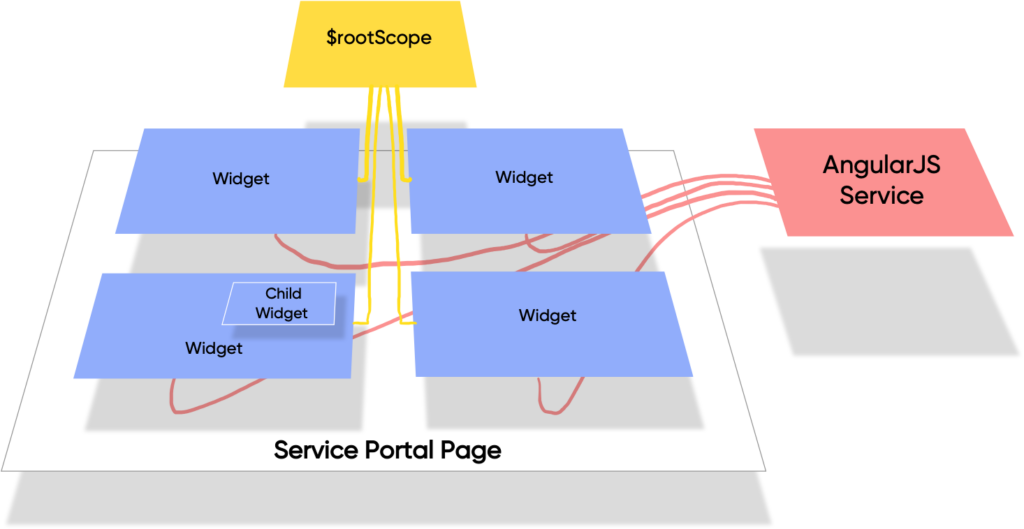
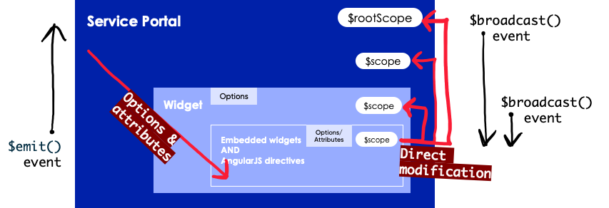
As discussed in the previous section, in Service Portal data can be passed down from the highest level of the Service Portal application itself, and into widgets on the Service Portal page using options. If those widgets on the page have other widgets embedded in them, or make use of AngularJS directives, data can continue to flow down into them through options and attributes, respectively.
However, widgets and Angular JS directives also have access to objects on the $scope of their parents, and also to the top level $rootScope. This can lead to a highly confusing application architecture where it’s not immediately clear what code is responsible for managing or modifying the state of the application. When an application is architected like this it’s also not fully testable.
In addition to this, events can also travel upwards (through the $scope.emit() function) and downwards (with $scope.broadcast() and $rootScope.broadcast()).
This flow of data and events could be represented as shown in the quite confusing diagram below:
Contrast that with Next Experience components, where data only travels downwards into a component via its properties, and components at a lower level do not have the ability to modify the state of parent components/macroponents. The architecture of applications built using these principles are much easier to understand, and are much more testable as well.
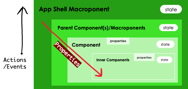
When something happens in an inner component for example, instead of updating the state of a parent, it would emit an action/event, and it is up to the parent that listens for that action/event to react to it and update its own state itself. Note that the terms action & event are for the purposes of this article the same thing, with the former being what it is called inside the source code of a component, and the latter what it is called in UI Builder.
Next Experience components have a much simpler architecture, where you pass data down through properties, and pass data up through events. It’s much easier to look at the code of a component and understand what is going on when compared to doing the same with a Service Portal widget.
Rendering & State
Management of the internal state of a component is the responsibility of the component itself. This internal state is stored on the state object, as properties with their values being any type of JavaScript value, such as an integer, an array, or another object.
In modern web applications, re-rendering can be an expensive operation to perform. To keep an application performant, developers need to be aware of when this re-rendering happens, and ensure it is only done when actually required. However, this very act of checking whether one is required can itself be quite an expensive operation and complex to determine.
An example of checking whether a re-render is required being expensive is with AngularJS, where there were big performance issues with the initial releases. With too many watchers running on a page (usually introduced by bindings in the template), pages would sometimes slow to a crawl. This lead to the introduction into AngularJS of one-time bindings, which tells it not to watch that value for changes once the value has settled and the initial binding has been established.
In addition to the above, with complex code in any system it’s very easy during debugging to end up in a situation where the application is in a broken state that’s hard to understand how it got there. One of the primary ways to fix issues is to understand how to reproduce that broken state, and then trace back all the things that happened to find the source of the issue.
Among other things, Next Experience components make use of the concept of immutability to assist with both these challenges.
An immutable object is defined on Wikipedia as follows:
”In object-oriented and functional programming, an immutable object is an object whose state cannot be modified after it is created.”
Immutable object, Wikipedia
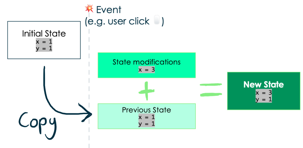
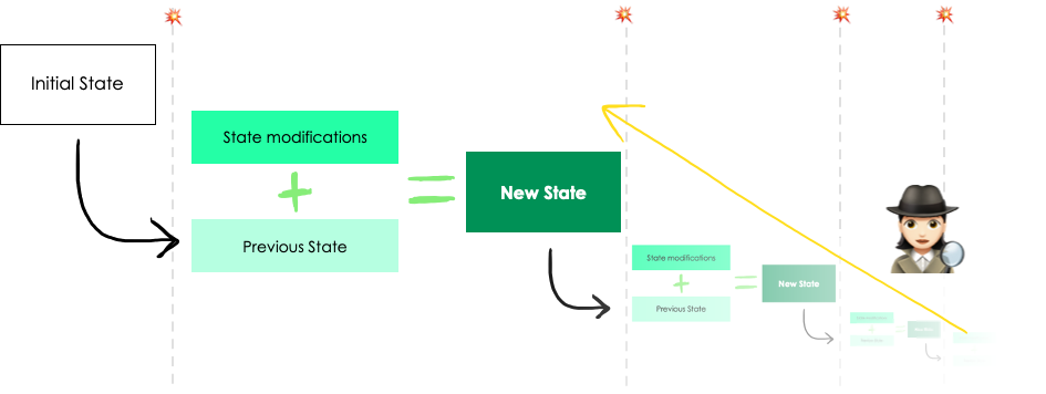
Each component has it’s own state object, which can be thought of as the source-of-truth for how the component should behave. For example, if your component has an “accordion” style expand/contract ability, your state might have a property on it called expanded.
Immutability means that instead of updating this property to true or false as the accordion expands and contracts, it creates a copy of this state with the modifications done to it and that becomes the new state.
A diagram showing this process is shown below, which upon an event happening such as a user click, a new state object is established for that component without modifying the previous state. Note that the event doesn’t need to be a user interaction; it could be a response received from the server for example.
This process repeats as shown below, with new state objects being established based on a copy of the previous state, and the modifications requested to that state by the updateState() function.
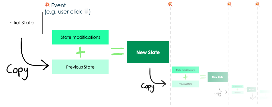
In addition to the above benefit, by copying state it becomes possible to inspect those modifications in reverse, and see what part of the code caused the application to get into a broken state. This can greatly assist with debugging.
Package Management
Package managers are used to define what external dependencies your project has, to retrieve those dependencies, and also to publish your component project so that other projects can include it as a dependency. It’s well worth reading the Mozilla Developer Network’s web docs on package management to understand what it is, and generally what the benefits of using a package manager are.
A good example of a package your component project might depend on is Google Maps, or one of the Next Experience components listed on the ServiceNow Developers site. For example, you might want to have a button in your component, in which case you could use the @servicenow/now-button component rather than creating your own button using HTML and having to consider browser compatibility, styling, accessibility etc of that button.
If you create a great, reusable component, you can also publish it to a package manager and allow your component to be leveraged in other component projects, in the same way that now-button is. On NPM you can also have private packages, so if you want to publish your component to be accessible by only colleagues in your company that is an option too. Private registries are possible to setup too, such as Sonatype Nexus, that allow you to publish packages privately in your company.
You would publish a component project to a package manager if you want your component to be leveraged by other component authors. If you simply want your component to be leveraged in UI Builder there is no need to publish your component project to a package manager; you just need to install the scoped app for that component (generated after running the deploy command) onto the relevant ServiceNow instance.
As the standard JavaScript package manager, when developing Next Experience components you’ll be using NPM. You’ll define what dependencies your project has in the package.json file at the root of the project (e.g. at least version 19.8.2 of now-button). You’ll then use the npm install command to install all the packages listed in there.
Service Portal doesn’t allow use of a package manager for dependencies. Any dependencies you want to use for your Service Portal widgets must have a JS Include record manually created, which can then be manually linked to a Widget Dependency or a Service Portal Theme. These JS Includes can link to either a remote JavaScript file (which could go missing, or be modified), or a UI Script with the code of the dependency pasted inside. Almost all external JavaScript libraries are built & documented with the intention for their use with NPM, and so often a large amount of code refactoring is needed for them to be stored inside a UI Script record for use as a JS Include.
Being able to use a package manager for Next Experience components will be a big benefit for developers.
Source vs Built Files
With Service Portal, you were creating widgets as records directly on a ServiceNow instance. With Next Experience components, you create them first locally with many supporting files (such as the previously mentioned package.json). Once created, you then deploy them; the act of doing so creates those records on a ServiceNow development instance as a scoped application.
These two different states that the component project exists in I refer to as the “source” state, and the “built” state, respectively. For reasons I’ll get to in a moment, both these states of the component project need to be stored in source control.
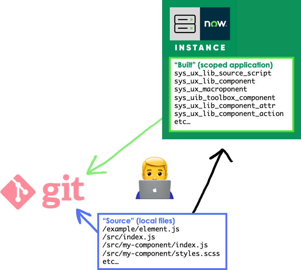
An example can be seen below of how these two states of the component project might appear in a Git repository. You don’t need to store both states in the same Git repo, but I do this to simplify things & reduce the amount of Git repos it’s necessary to have for a single component project.
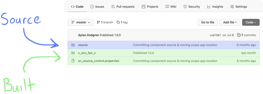
When you import this application with both the source and built state in it from source control via ServiceNow Studio, it will look at the sn_source_control.properties file which in this example simply contains the string path=x_snc_fpc_c. This allows the instance to know to import the application from the x_snc_fpc_c directory. Alongside these is a source directory, which contains the component project’s source state; i.e., the source JavaScript, package.json file, now-ui.json file etc.
The question you might be asking, is why do I need to store the component project’s built state? If I need it in this state, can’t I just deploy the source files to an instance again? Let’s address that question.
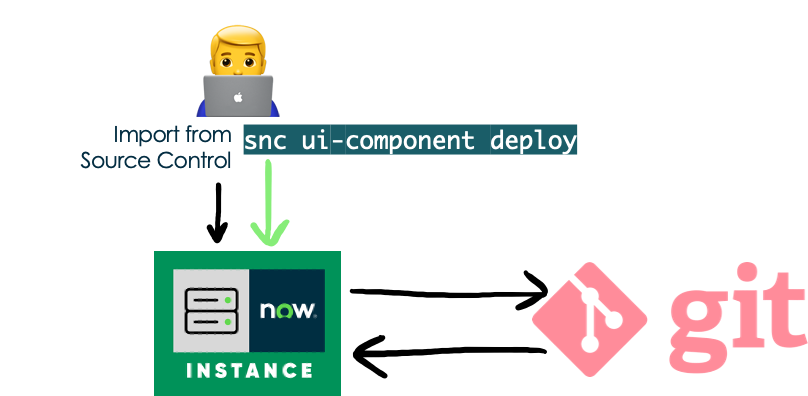
Most of the time, you’ll be using the ServiceNow App Repo to move the scoped application containing the built component project across to your Test/QA/Production instances. For the initial deploy of the component project this will work fine, however once that scoped application exists in your company’s App Repo, it will no longer be possible to deploy that component to a brand new instance as that would require creating that scope again. When creating a scope, the ServiceNow instance checks whether that scope name has already been used, and if so it doesn’t allow that application to be created.
How this will present itself is when you run snc ui-component deploy you will receive a 400 error back, with the message This scope is already taken by another application.
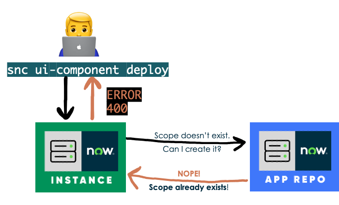
This is why you need to store both states of the component project in source control. You need to store the source state to maintain the component of course. You also need to store the built state to allow you to deploy the component to an instance that the component hasn’t already been deployed to. To do so you’ll need to import the application from source control, and once the application is on the instance you can run the deploy command as usual which will succeed.
Conclusion
I hope this article has helped you to get a jump start in the new paradigm of Next Experience components by understanding some key differences from their Service Portal counterpart.
Feel free to leave feedback in the comments below, or reach out to me on twitter with my handle @dylanlindgren.